<h:selectOneRadio>
<f:selectItem itemLabel=": Cheque" itemValue="1" />
<f:selectItem itemLabel=":Cash" itemValue="2" />
</h:selectOneRadio>
<f:selectItem itemLabel=": Cheque" itemValue="1" />
<f:selectItem itemLabel=":Cash" itemValue="2" />
</h:selectOneRadio>
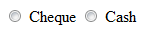
The appearance of finally rendered component is as below. The Select Items are laid horizontally by default.
If you want to arrange them vertically then change the 'layout' attribute as below.
<h:selectOneRadio layout="pageDirection">
<f:selectItem itemLabel="Cheque" itemValue="1" />
<f:selectItem itemLabel="Cash" itemValue="2" />
</h:selectOneRadio>
<f:selectItem itemLabel="Cheque" itemValue="1" />
<f:selectItem itemLabel="Cash" itemValue="2" />
</h:selectOneRadio>

However if you want to place the labels of 'Select Items' components before the radio buttons you have to use css.
<style>
.myRad td {
text-align:right;
}
.myRad td input {
float:right;
width:35px;
}
</style>
<h:selectOneRadio layout="pageDirection" styleClass="myRad">
<f:selectItem itemLabel="Cheque :" itemValue="1" />
<f:selectItem itemLabel="Cash :" itemValue="2" />
</h:selectOneRadio>

No comments:
Post a Comment